

With a perfectly designed website on desktop, but issues when browsing from a smartphone, chances are, you are losing potential clients on a daily basis and not even realizing it.
SEO Issues caused by responsive website design problems can lead to poor ranking, lost traffic, and loss of profit for your business here in the United States. Because Google now uses mobile-first indexing, the mobile version of your site will be part of the ranking process. Also, considering over 60% of web traffic is generated through smartphones, just one issue with your responsive design can be costing you hundreds or even thousands of dollars monthly.
In this guide, you will learn about the 7 most common responsive website design problems we come across, how each one negatively affects your SEO ranking, and the solutions that will improve performance on all devices.
What Is Responsive Web Design — And Why It Is Non-Negotiable in 2026
Responsive web design involves designing web pages that adjust their layouts, content, and images according to the screen sizes of devices being used by customers – whether smartphones, tablets, laptops, or desktops. The objective here is to create one website that works well across all platforms.
By the year 2026, it will be important for the existence of companies. This is due to Google’s mobile-first indexing where your website gets indexed via the mobile version. Websites without responsive design get low ranks on the search engines, loading slowly, and getting poor conversion rate despite having great content.
Companies that decide to deal with issues related to responsive web design can get very rewarding benefits from them through improved bounce rates, session time, Core Web Vitals metrics, and higher conversion rates.
The 7 Biggest Responsive Website Design Mistakes

Mistake #1 — Ignoring Mobile-First Design
Optimizing the layout for desktop use first is by far the most widespread—and costly—error in responsive design a company can possibly commit.
A desktop-first design process ignores mobiles. The effect is a poorly designed page with large elements, a hard-to-navigate layout, small buttons and other controls, making it difficult for mobile users to do anything but look elsewhere. Since Google evaluates the mobile version of your website, having a bad mobile user experience will affect your ranking on Google.
Solution: Design for mobiles first, from day one. Mobile-first design processes ensure your website is optimized for mobiles first and then scaled up as screens get larger.

Mistake #2 — Fixed-Width Layouts and Poor Breakpoints
The fixed layouts are set to a particular width in pixels. In case the user visits using another device, the entire layout collapses; text runs out of space, columns crumble, and images overlap with one another. The entire layout looks very messy, and thus, the user will leave the site instantly to go back to Google.
The use of wrong breakpoints makes the problem even harder to handle. If the developer sets the breakpoints according to particular device widths, he/she is left chasing the new screen resolutions as devices evolve. Within a few months, your website may have a broken layout on the latest models of iPhone and Samsung.
The Solution: Use fluid and percentage-based layouts in combination with CSS media queries. Breakpoints should be based on where the content flows well.
Mistake #3 — Poor Navigation and Touch Experience
Desktop navigation is designed in a way that makes mouse usage easy. Desktop navigation is designed pixel perfectly for navigation purposes. The difference between mobile and desktop navigation lies in the fact that there is no precision in mobile navigation. Bigger and well-spaced tap targets work best on mobiles. Navigation buttons which are too small, too crowded, or hidden inside a hamburger menu drive users away, increasing bounce rates.
Bounce rates and dwell times are among the factors Google considers when ranking websites through search engines. If your mobile navigation is poorly designed, not only will users find difficulty navigating your site, but your SEO will also be affected negatively.
The Solution: Design For Taps. Your target buttons should not be smaller than 44×44 px, and there should also be proper spacing between the buttons. Design a good mobile navigation using sticky header, bottom bar, or good hamburger menu. Test everything on actual mobile devices and not browser emulators.

Mistake #4 — Unoptimized Images and Slow Page Speed
The use of uncompressed images on websites leads to the issue of slow loading speed on mobile devices. Several researches have already proved that any site with a loading speed of more than 3 seconds will lose over 50% of its audience. It means that you will not comply with the LCP, FID, and CLS requirements of Core Web Vitals, so your web pages will rank lower in the search engines’ results.
What is worse, such an issue concerns mobile users in particular, because loading speed may differ greatly despite a high internet speed connection. To be specific, the loading speed of an image via fiber optic is instant while the same image will take up to 8 seconds on a mobile device.
Possible solution: Apply responsive images via the srcset attribute to enable different-sized images based on the device type used. Also, compress all images before uploading them, convert them into WebP format, and use Lazy Loading on images which should only appear below the fold on the webpage.
Mistake #5 — Unreadable Typography on Mobile
A font of 13px or 14px that can be legibly viewed on a computer screen at full size is almost unreadable on the mobile device screen that measures 375px. When this problem is combined with inadequate line and paragraph spacing, the result is that your content is not going to be readable by anyone.
Unreadability causes lower time spent on a page, which is a bad indicator for Google search engines. Your content won’t be ranked either because Google knows it’s not valuable since it’s not getting any engagement.
Solution: Optimize your typography for all devices. Use a baseline 16px font on mobile devices. Keep the spacing for lines between 1.5 and 1.7, and allow space between paragraphs.
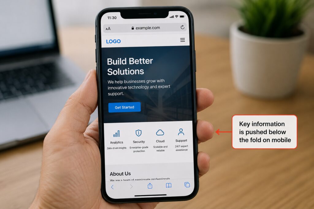
Mistake #6 — Hiding or Deprioritizing Key Content on Mobile
Many companies make the mistake of hiding essential information in the mobile format – information about the services provided, price tables, calls-to-action – thinking that minimizing space used increases user experience. That does not help because it hides away the information people seek to find, and, more importantly, eliminates information that Google uses to rank your business.
As Google ranks your business based on your website’s mobile version, if certain information is not available or hidden in the mobile version of your site, then, for the purpose of ranking, it simply does not exist.
The Solution: Place content on the basis of its business value, not space constraints. Put forward your key messages and calls-to-action in the above-the-fold area for both desktop and mobile versions. Use accordions for additional information.
Mistake #7 — Skipping Accessibility and Real-Device Testing
A responsive website developed without testing in real devices resembles an article published without proofreading. It may be working perfectly well in Chrome DevTools but when you open it in a Samsung Galaxy S24 or iPhone 15 it won’t even load properly. This is the problem with the simulator browser.
Accessibility standards have become much more than a nice-to-have feature today. It’s now a ranking factor for SEO and a mandatory practice that must be adhered to. Non-compliance to WCAG 2.1 will make your site inaccessible by the majority of visitors and will show poor quality to the bots from Google.
Solution: Actual device testing. Test your website after every update in Google’s mobile-friendly test and page speed insights tests. Your website should adhere to standards of semantic HTML, Alt tags, navigation using keyboard, proper color ratio contrast and cross-browser testing in Chrome, Safari and Firefox browsers.

Responsive Design Audit Checklist
Do this checklist before going live, or before your next website update:
✓ Design
Flexible grids, not fixed-size boxes, break points should be based on content requirements and not device sizes
✓ Typography
16px and above base font size on mobile, scalable typography, good line heights (1.5–1.7), proper spacing
✓ Navigation
44 x 44 px touch targets tested on actual devices, mobile navigation design patterns
✓ Images & Media
Proper compression, using WebP, implementation of the srcset tag, lazy loading
✓ Performance
Meets the Core Web Vitals test with pagespeed score of 80 and above on mobile and largest contentful paint within 2.5 seconds
✓ Accessibility
Meets the standards set by WCAG 2.1, has semantics in HTML, uses alt-texts in all images, and color contrast ratio is appropriate
✓ Testing
Has been tested using real iOS and Android devices along with cross browser testing in Chrome, Safari, and Firefox

Responsive Design Is an Ongoing Investment — Not a One-Time Fix
Once is not going to cut it for making these corrections. New devices appear every quarter. Google releases new algorithm changes a few times per year. New screen sizes keep coming into the picture. Responsive website optimization is a practice that requires constant dedication.
Companies that embrace responsive design as an ongoing practice – conducting regular audits, monitoring, and fixing – will beat out competitors who just set-and-forget about it. The companies that will be thriving in 2026 are those that work on their website regularly.
Here at SEO Leadz, we handle everything related to responsive website optimization services for both local and nationwide clients all over the United States. From comprehensive mobile audits to website redesign and maintenance – no matter what, we’ve got you covered.

Hi, I’m Kashaf Attiq, founder of SEOLeadz. From custom web development and content writing to advanced SEO and guest posting, I turn websites into powerful, lead-generating machines. Stick around for actionable tips, or reach out to scale your business!